Confusing navigation
A disorganized structure that was losing users along the way
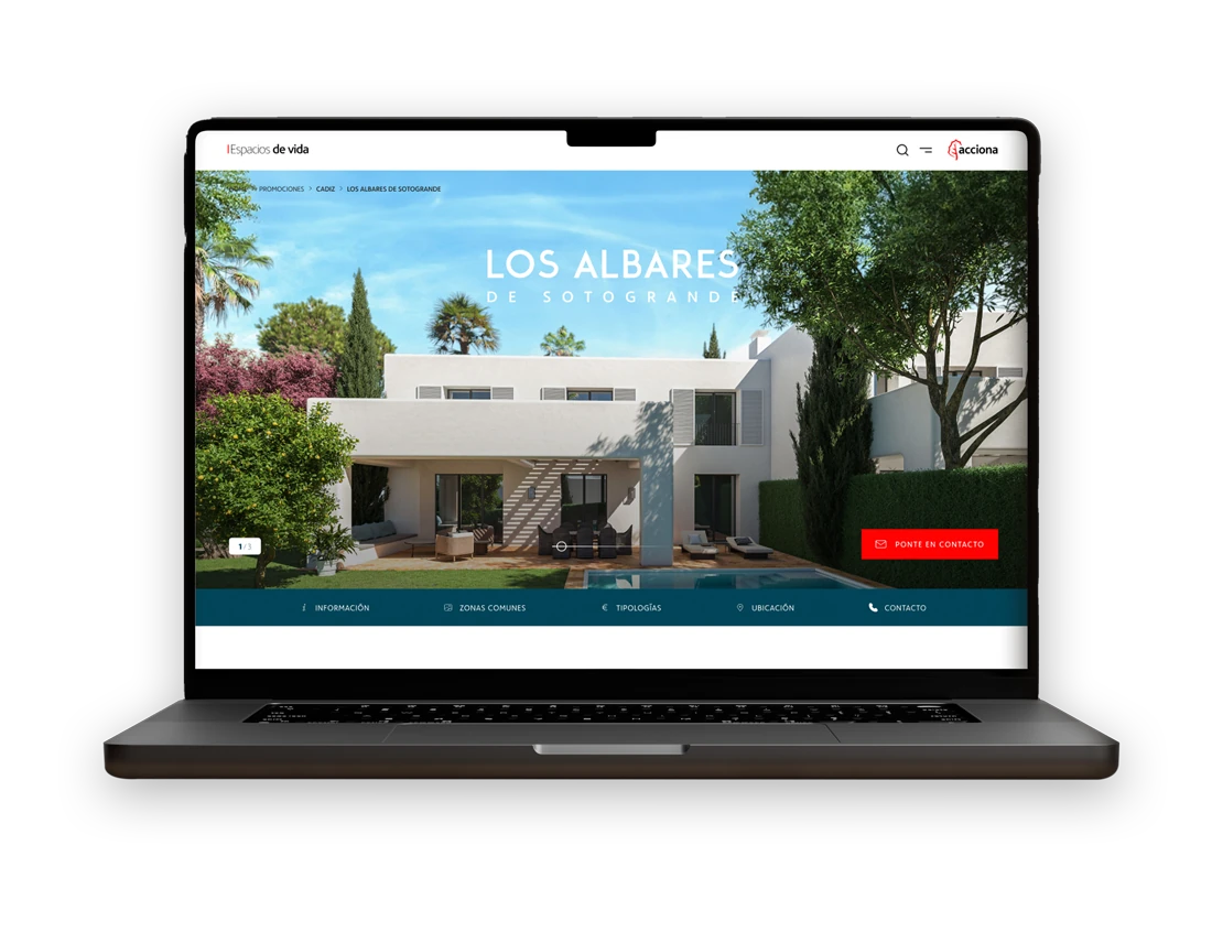
I led the complete redesign of their digital experience, at the head of a team of 8. We started with in-depth research into user behavior. That's where we found exactly where conversion was being lost. We focused on making the information on property pages clearer. We wanted an intuitive structure that made it easy to find what people were looking for.
The previous site was falling apart: just a bunch of disconnected, standalone landing pages. Finding information there was a real headache. The experience was full of errors and confusion.
What did users actually want? For browsing homes to feel intuitive, not like a chore. We built a solid information architecture and a reusable design system. And we updated the entire visual language to today's standards.
A disorganized structure that was losing users along the way
No dynamic, personalized filters for user interaction
An outdated design that didn't reflect the brand's real value
More than 60% of users never completed the forms
We completely redesigned the web experience, bringing all the landing pages together. Everything now lives on a single, much more organized site. We simplified the navigation and adjusted the visual hierarchy. We built a reusable component system for consistency. This removed friction for users and made life a lot easier for the development team.
Competitive analysis and research, backed by clear methodologies to get real results
Creation of a reusable design system, with clear components and guidelines
User testing, client feedback, and optimization alongside the dev team